From time to time I will highlight new websites or redesigns I have worked on. In my last post for example, I featured the recent redesign of the Graduation site. With these posts my aim is to illustrate some of the techniques used for planning and producing content and approaches to designing how this content is displayed.
Imperial students redesign
The subject of this project was slightly different as it was the redesign of a single, albeit important page – the main landing page for students. As the students section of the site receives over 900,000 visits a year, it was important to go through many of the same steps I would do for a whole site redesign.
Why did we redesign the page?
Student services and resources are provided by various departments and teams around the College and the information about these is published across several websites. This meant that students were struggling to find the information they needed, especially if they didn’t know which department or team provides the service. To improve this, the Registry identified the Current students page as a place that could act as signpost to all this useful content.
After an initial meeting we also suggested a couple of other improvements that were needed to the Current students page:
- to have a way of promoting certain content that is important at different times of the year. For example, new student information, graduation, exams etc.
- to have content produced by students on the page
1. User research and testing
The first step was to find out which services needed to feature on the page. Registry ran a small focus group session with a few students to identify these services, understand the terminology that students use to describe these and to group the services into sensible categories. Together with colleagues in Registry and the Education Office, we refined this list and then tested it with 20 students using a tree testing exercise. The results of this testing were very positive, but there were a couple of areas which needed to be reviewed.
2. Page design
Now that we knew what content would be on the page, I then produced a number of different mockups to show different ways to present this, and invited the group to give their feedback on these until we decided on the final design. Here are a selection of those designs:
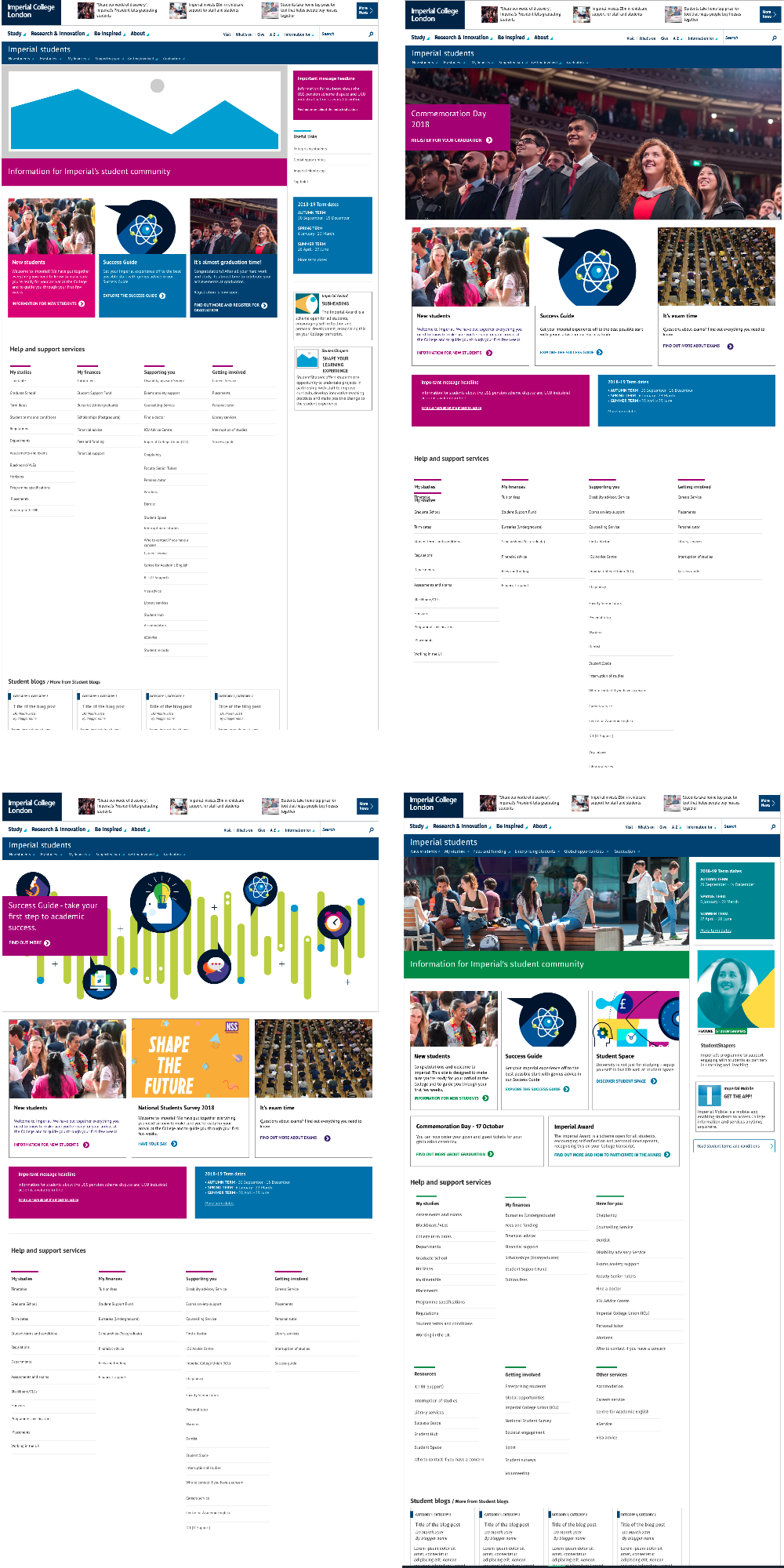
3. Agreeing the final page content
The final step was to review the content for the feature areas of the page and the hierarchy of it. This was done by a group ranking exercise.
4. Launching the page
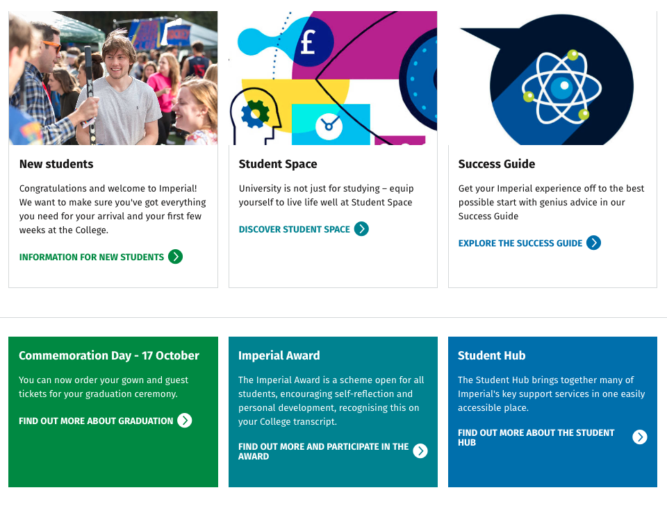
The new Imperial students page was launched on 12 September. The new page has the following new features:
- features area for seasonal content
- categorised list of help and support services
- A feed from the Students blog to provide student-generated content on the page

5. Evaluation
The plan is to monitor usage of the page over the coming months and to gather feedback from students. We will also review the feature content every few months in order to ensure it reflects what is important to students throughout the year.